DiDi Design Systems
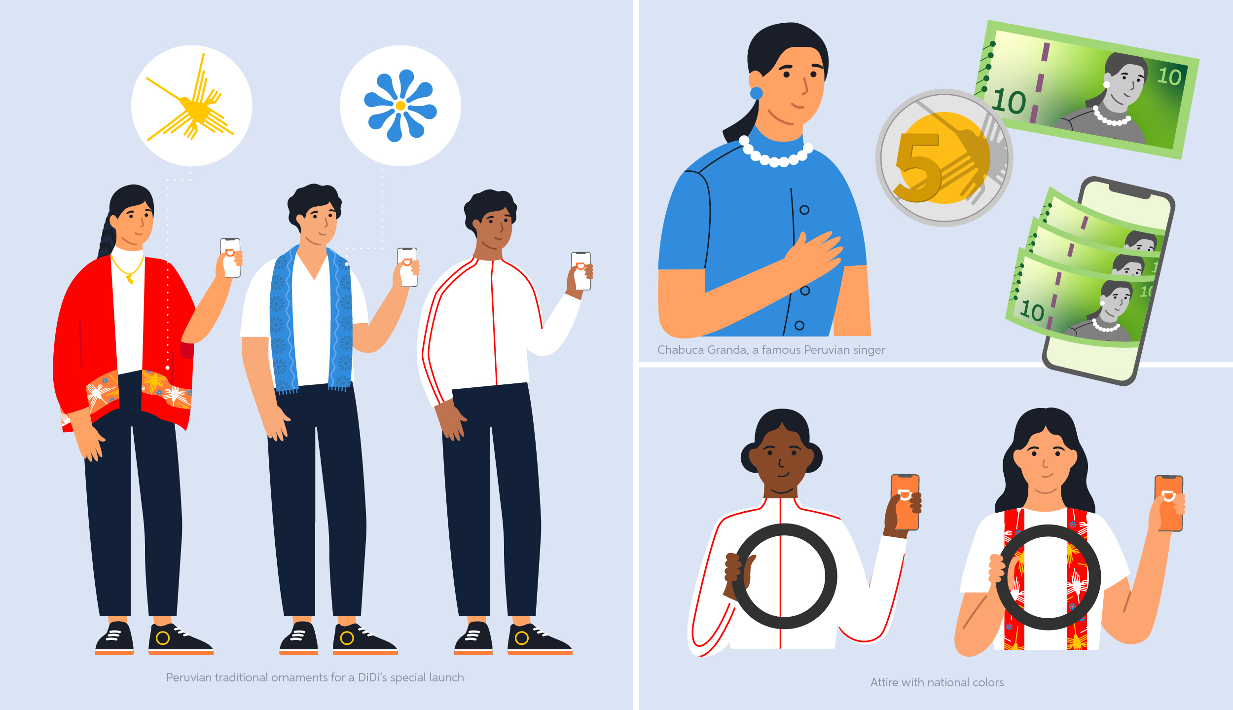
DiDi is a Chinese ride-hailing app operating in more than 8 Latin American markets, competing with multiple ride-hailing apps, unlike China, where it has no competition. The visual illustration system inherited from headquarters was too generic to build brand credibility in the region and didn’t reflect its diversity.
At the same time, the team was producing hundreds of digital assets monthly such as emails, landing pages, in-app banners, without the ideal design software, access to stock images, or a shared visual framework. The result was inconsistent communications that varied by designer and by country with increased delivery times since each designer had to create almost from scratch.
The challenge was to build a scalable visual infrastructure within significant technical constraints that allowed easy modifications and increased brand consistency.
The solution was to create two interconnected systems: an Illustration System and a Digital Communication Guidelines System. As the Digital Communications Sr. Designer for Latam, I led the design and implementation of both systems.
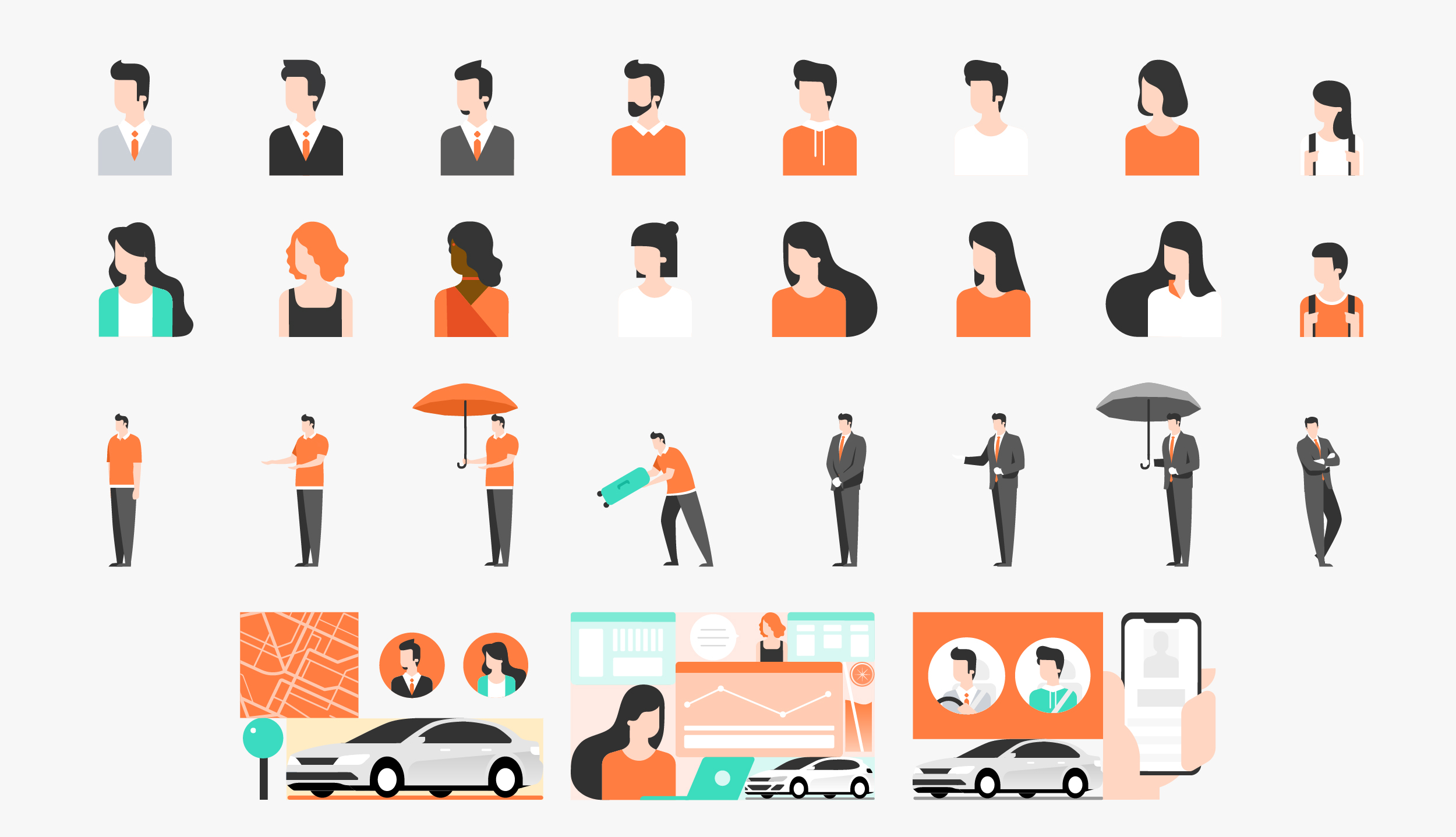
Solution 01: An Illustration System
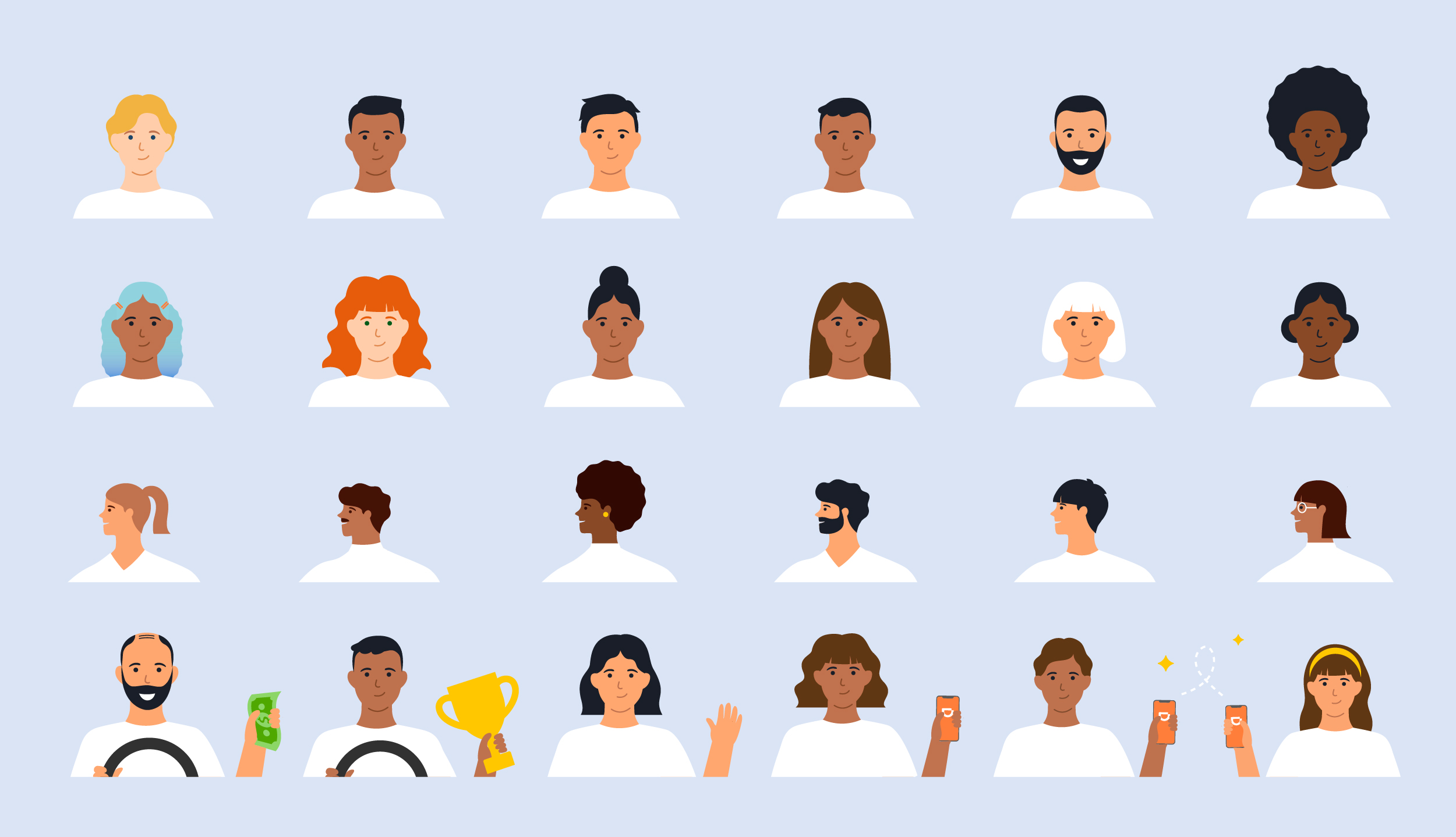
The system was designed to be modular, vectorial, and quickly adaptable to different topics, seasonality, and audiences. Vector images allowed digital communications such as emails and landing pages to be smaller in size.

The modularity of the system made it adaptable to the broad portfolio of DiDi's new services, such as motorcycle rides and delivery.


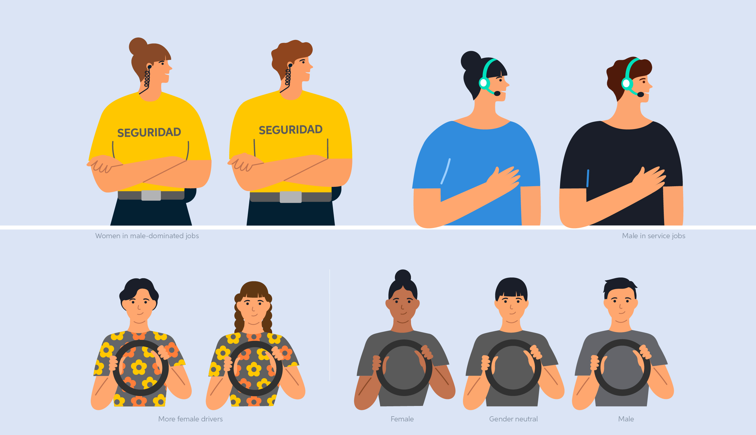
DiDi is a global company and diversity is one of its most significant values, therefore, I wanted the characters to really represent Latin America, very heterogeneous region. I focused on three main categories: gender, race, and relationships.

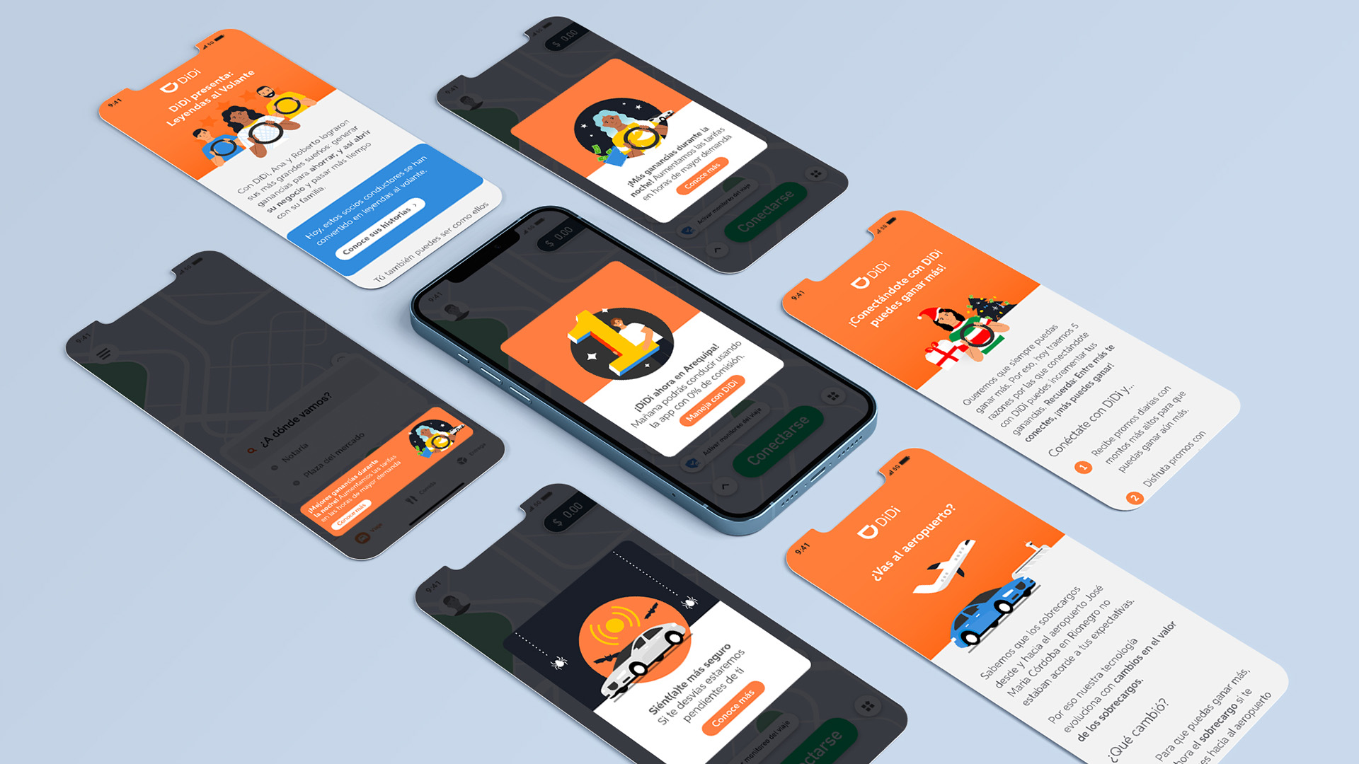
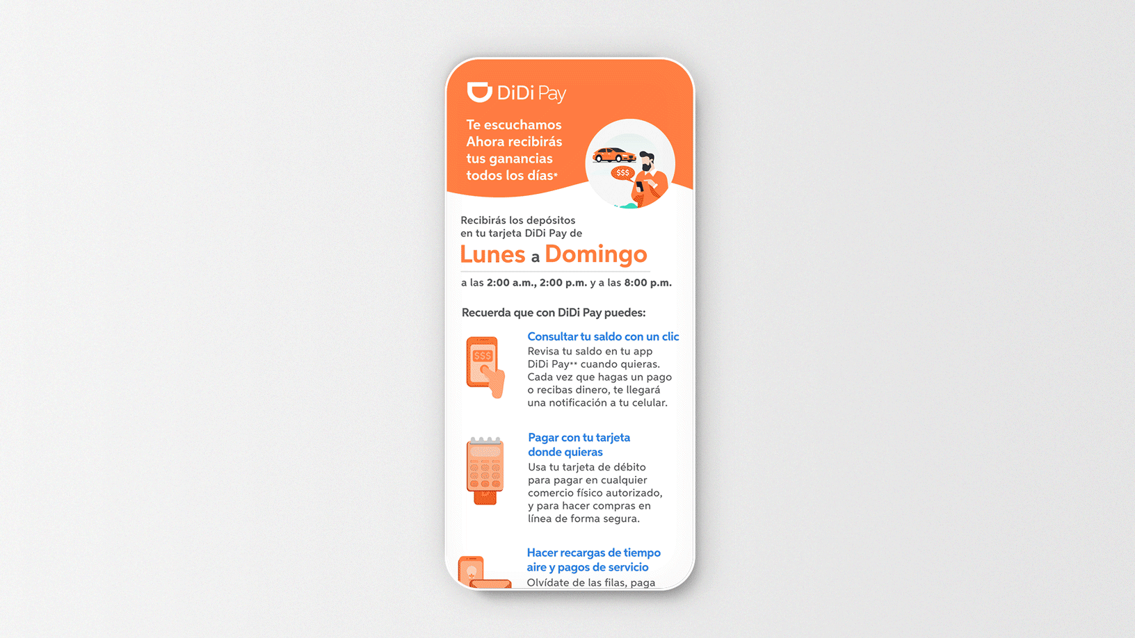
Solution 02: Digital Communication Guidelines System
The first priority was standardizing graphic elements to establish a cohesive visual language across all communications.
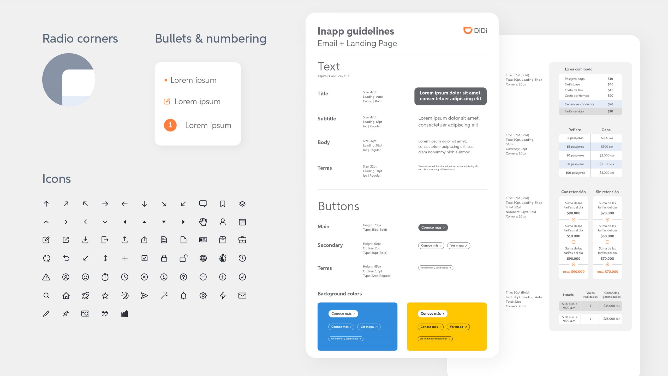
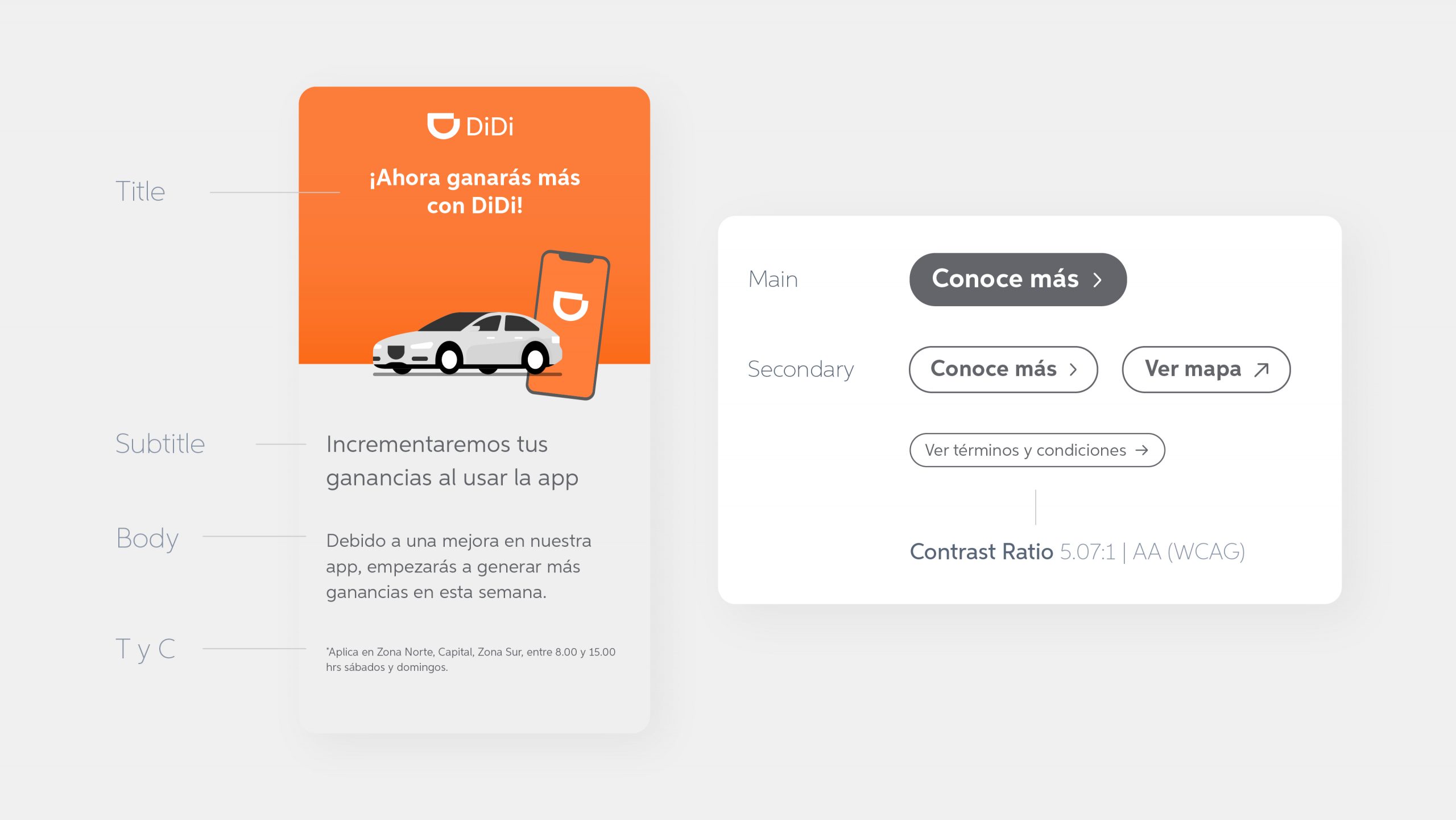
Accessibility was also a priority: establishing clear visual hierarchy, improving contrast ratios to meet AA WCAG standards, and increasing typography sizes.
The next step was to create templates and files that were scalable and ready to use for designers, so they had to spend less time creating the assets.
Another important feature was the creation of an UI gallery of the most used screens, so they could be used when explaining aspects of the app as well as showing a step by step instruction

Impact
The two systems were adopted across the Latam team in 8 countries: Dominican Republic, Panama, Costa Rica, Colombia, Ecuador, Peru, Chile and Argentina.
20% improvement in user experience scores
Reduced delivery times and boosted team efficiency by 45%
Design team satisfaction increased from 75% to 100%
Increased brand consistency across 8 Latin American countries
© Leyla Vargas