Arlekín Publishing Company
Editorial Arlekín is a small independent Costa Rican publisher specialized in academic and literary titles, including philosophy, poetry, essays, and fiction.
As the sole designer, I was responsible for the full visual direction of each title: concept, photography, illustration, and typography. Over the course of the collaboration, I designed approximately 80 covers modernizing the publisher's visual presence.
Client
Arlekín Publishing Company
Role
Editorial Design, Art Direction
Year
2015-2018
Challenge
Two constraints shaped every cover. The first was editorial: the catalogue was mostly non-commercial and abstract subjects, which made each cover an exercise in translating ideas into something readable and visually interesting at the same time.
The second was practical: no stock imagery, no external collaborators, no art director. Every cover had to be argued conceptually and produced entirely in-house, that's where I stepped in. Therefore, illustration became one of the most recurring tools. When a cover called for photography, I took the photos myself.
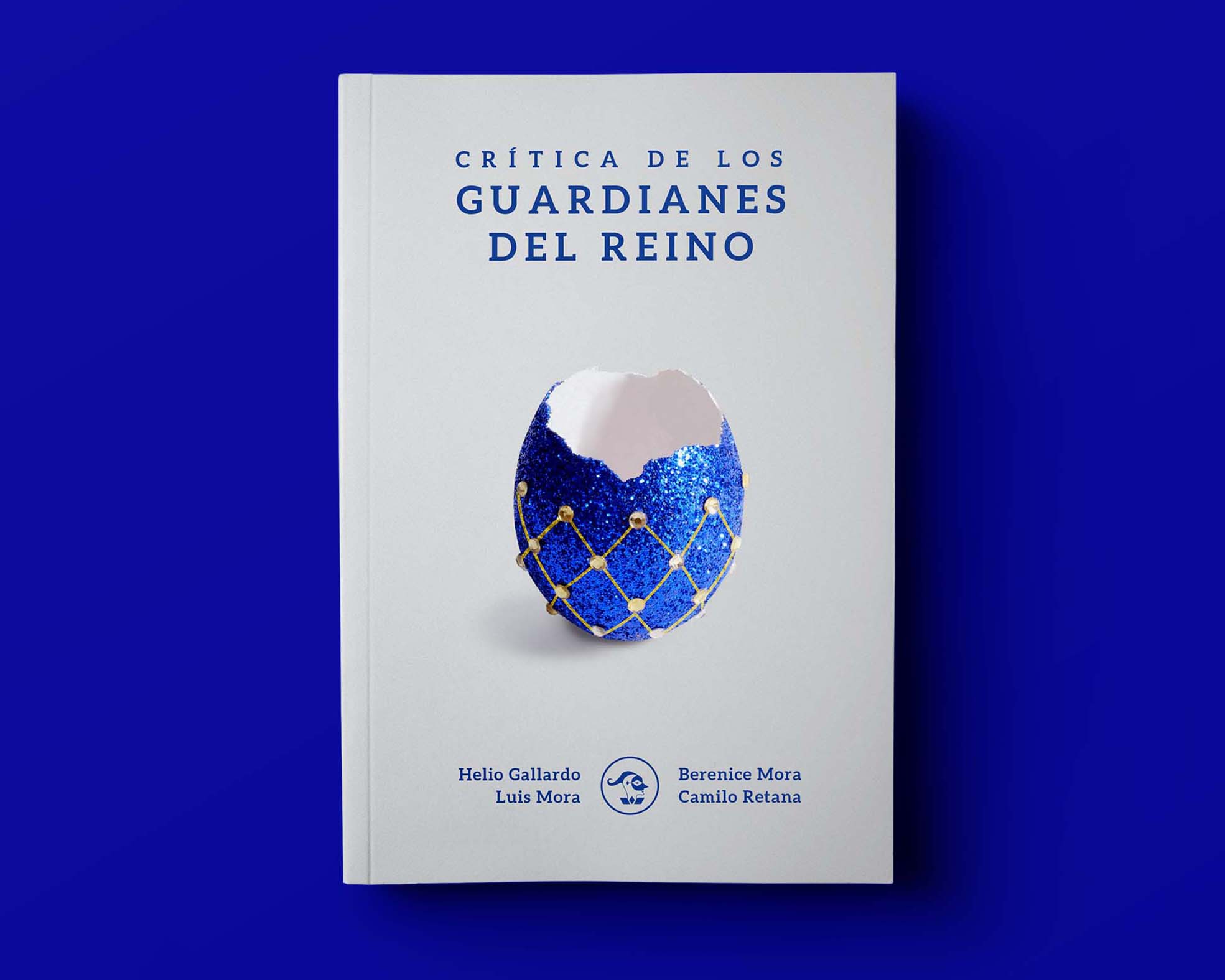
Guardians of the kingdom
A critical homage to The Impossible Country of the Philosophers, a foundational text on Costa Rica's philosophical tradition and its essentialist view of national identity. The book's core argument is that the country imagines itself as something idyllic and perfect, and that those ideas collapse on inspection.
I resolved it through metaphor: an egg in royal blue and gold, a miniature kingdom that is beautiful on the surface, hollow inside, and breaks at a touch.
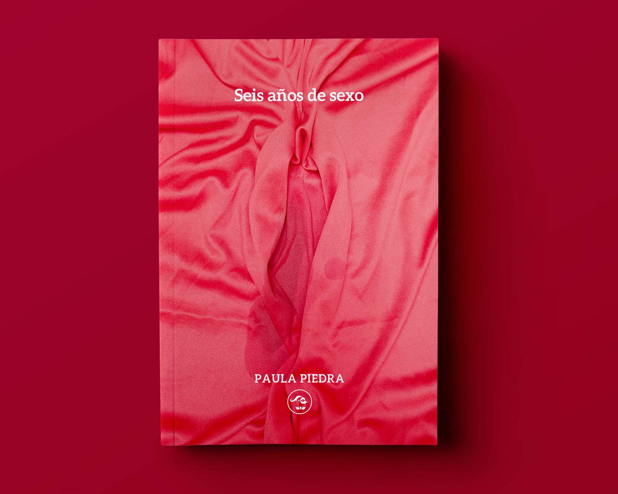
Seix years of sex
A book compiling six years of sex columns originally published in SoHo magazine Costa Rica, written by Paula Piedra under three pseudonyms. I decided that the cover had to hold the sensual register of the content without adopting the visual conventions of the original publication, a female body as object of desire.
I selected red as a baseline for skin, sensuality and heat. The final image suggests a body in abstract, and a composition that evokes female anatomy with a small damp mark that shows pleasure, showing her own perspective rather than an external gaze.
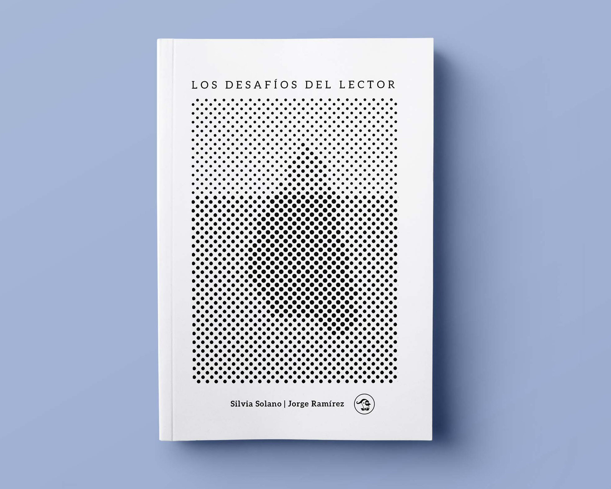
The reader's challenge
An academic book on literary reading as interpretive practice, built around the iceberg analogy: only a fraction of a text's meaning is visible on the surface. The cover makes that idea operational — a field of black dots that resolves into an iceberg only when the reader steps back, dissolving into pure pattern up close.
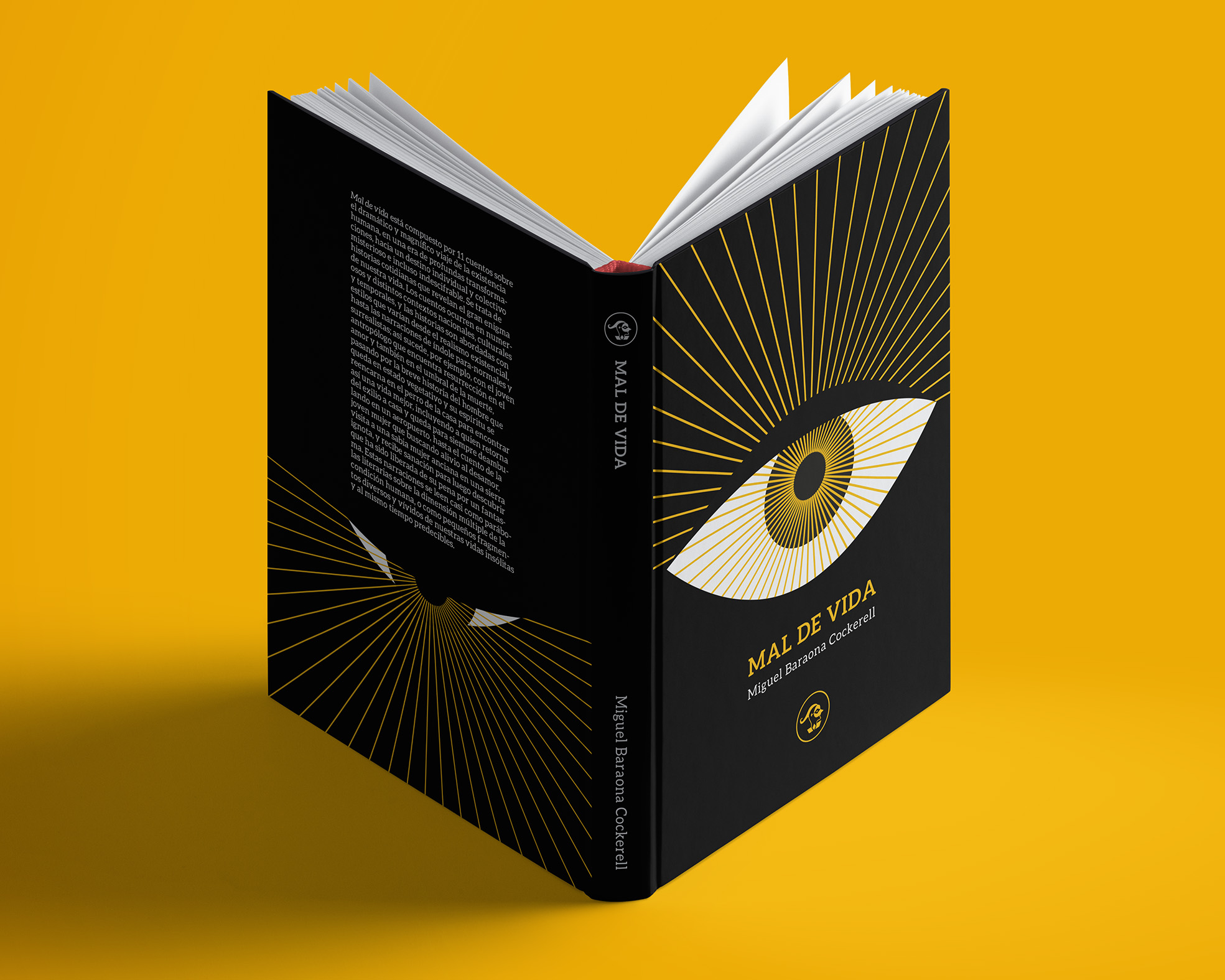
Mal de vida
A book of eleven stories tracing the arc of human existence, from birth to death, across registers that move between existential realism and the supernatural.
I designed the book as a narrative object: a radiant open eye on the front, and the same eye on the back almost extinguished. The reader's passage through the book mirrors the arc the stories describe. Gold lines over black set the mood: ritual, nocturnal, slightly esoteric.
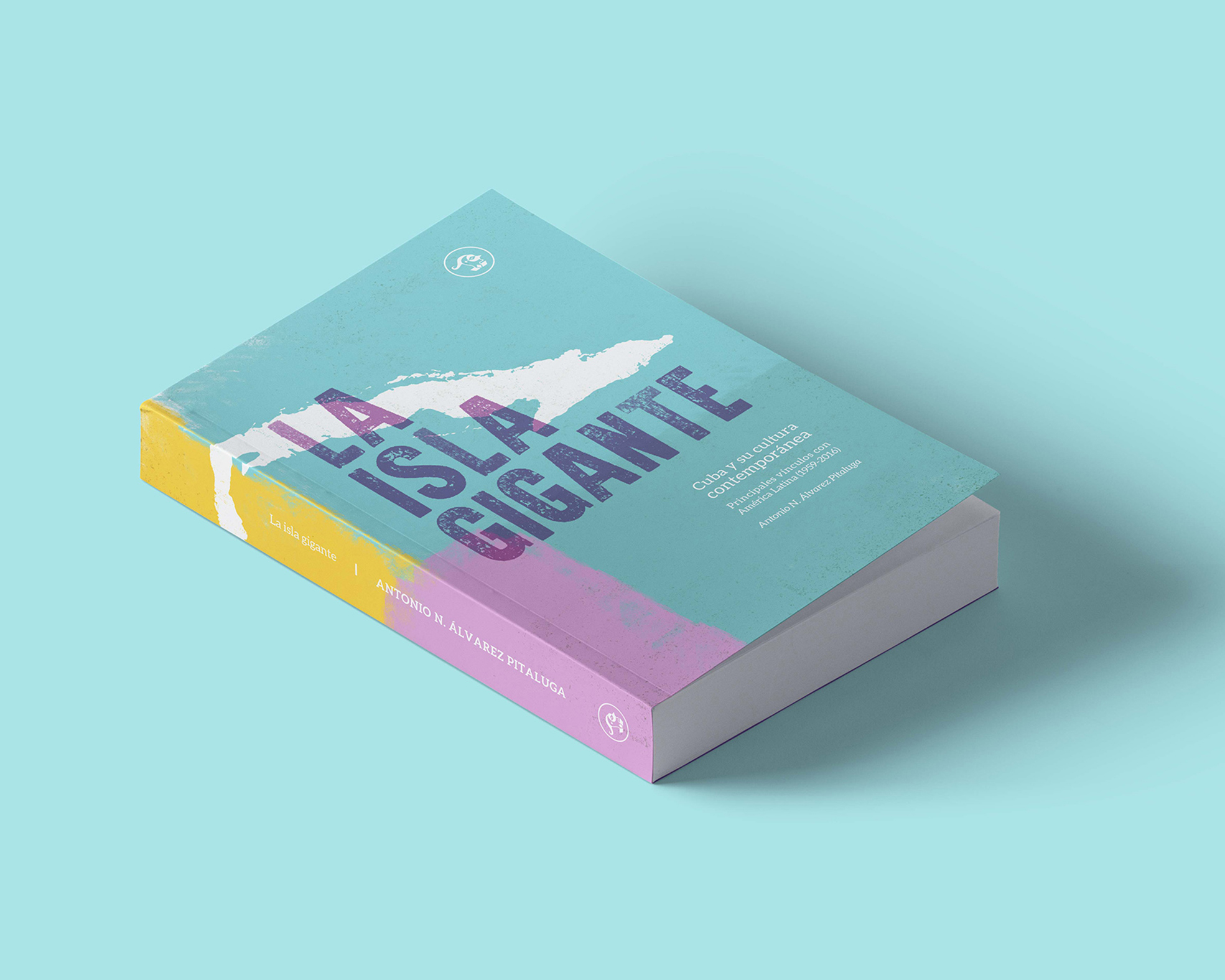
The giant island
An academic history of Cuban culture from 1959 to 2016, a span too wide to be represented by any single image without anchoring the book in one decade over the others.
I treated the cover as an exercise in typography and landscape instead of iconography: the torn silhouette of the island carries the subject, and the weathered pastels and textured surfaces evoke the atmosphere of the place without pinning it to a specific period. The visual language leans on a register of Cuba that most readers recognize (walls, sun, time) precisely because it belongs to every decade and to none.
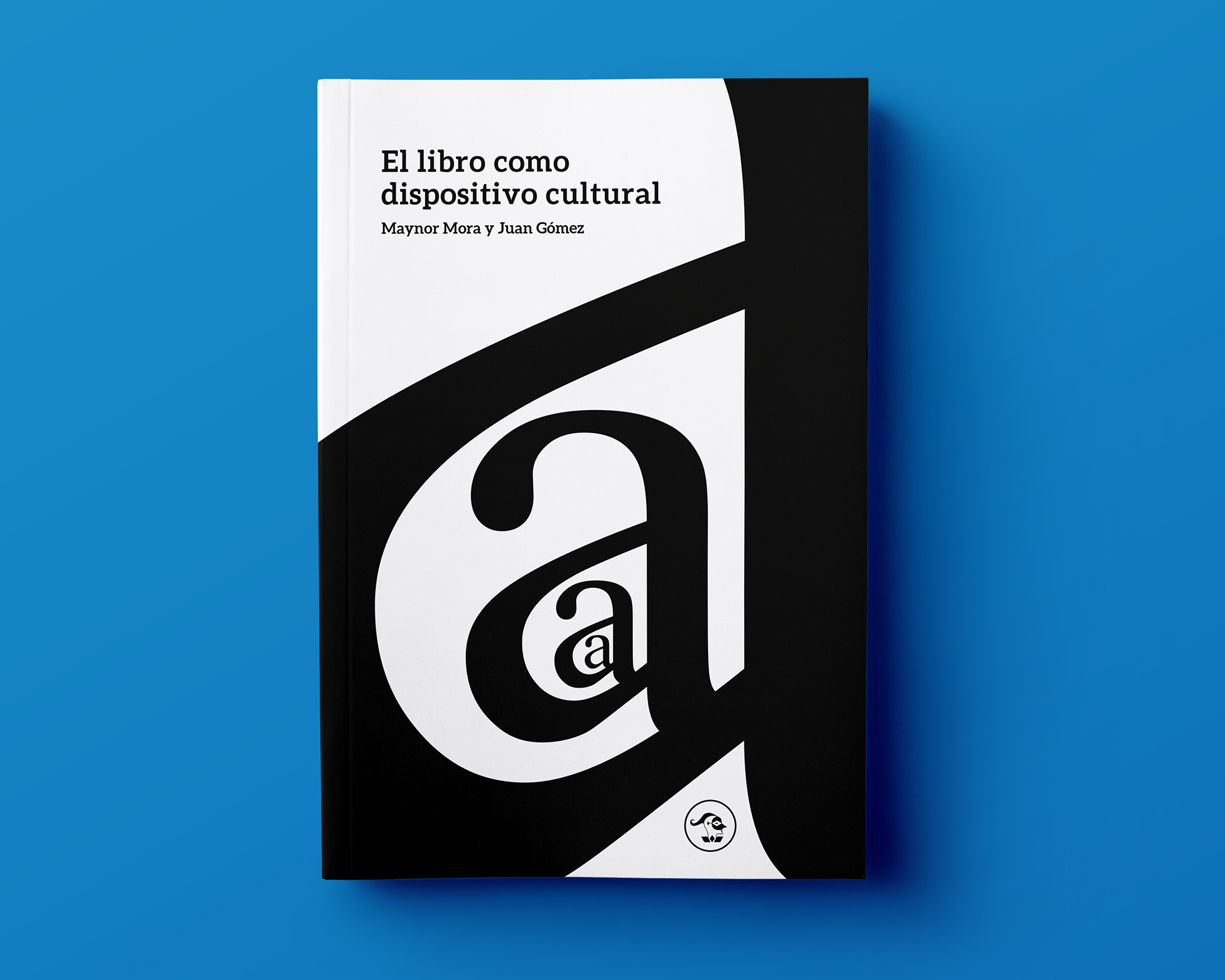
Book as a cultural device
A short essay on the book as cultural device, on how an object of signs became a stable idea, and how that idea is now being destabilized by the digitization of knowledge. The book's argument is that a book is not a rectangle with pages and a spine, but a set of signs arranged in order to be decoded and read.
The cover makes the same claim visually. I reduced the object to the minimum unit of language itself: the letter a, the first sign a reader learns. Nested and repeated in serif at different scales, the composition becomes what it describes: a system of signs arranged in order.
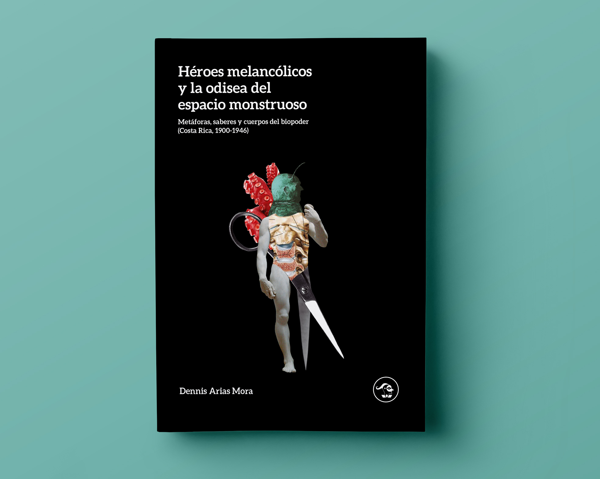
Melancholy heroes and the odyssey of monstrous space
An academic study of biopower and political metaphor in early twentieth-century Costa Rica, how images of parasites, ogres, and monstrous bodies circulated in political writing to narrate citizenship, disease, and otherness.
The cover assembles the monster through collage, Michelangelo's David (the canonical ideal body) overtaken by tentacles, exposed organs, and a pair of scissors.
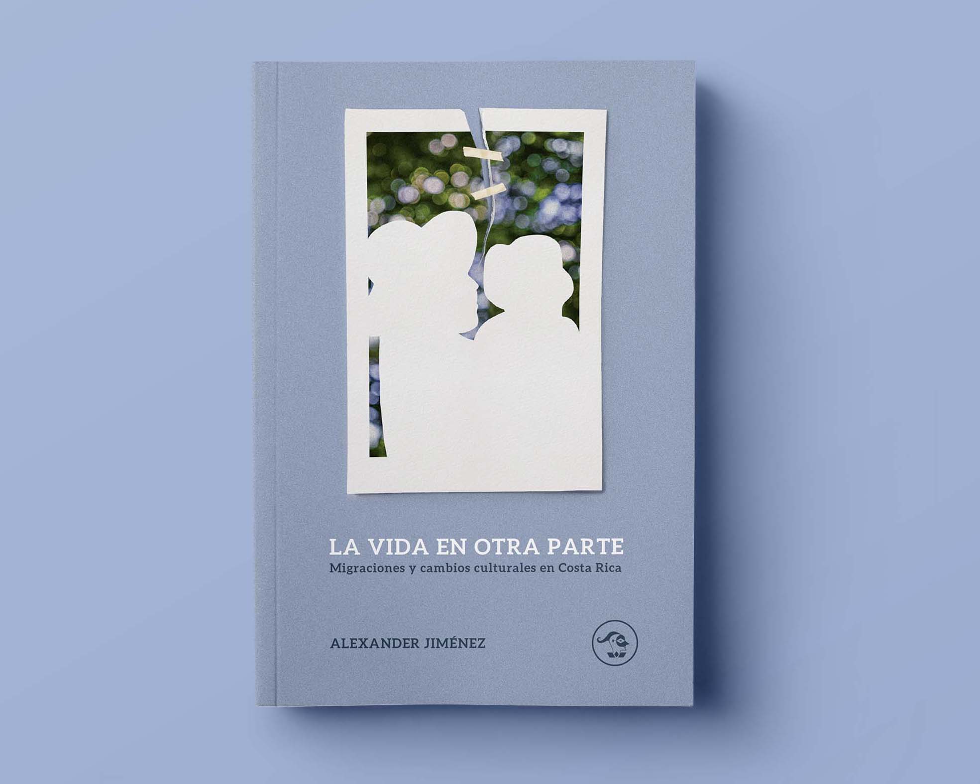
Life elsewhere
An essay on migration and cultural change in Costa Rica, written from the understanding that migrants carry with them aspirations, families, and future,not only labor.
I condensed that idea into a single object: a photograph torn and taped back together, framing the silhouettes of an adult and a child against a diffused landscape. Not a family portrait, but the act of keeping one.
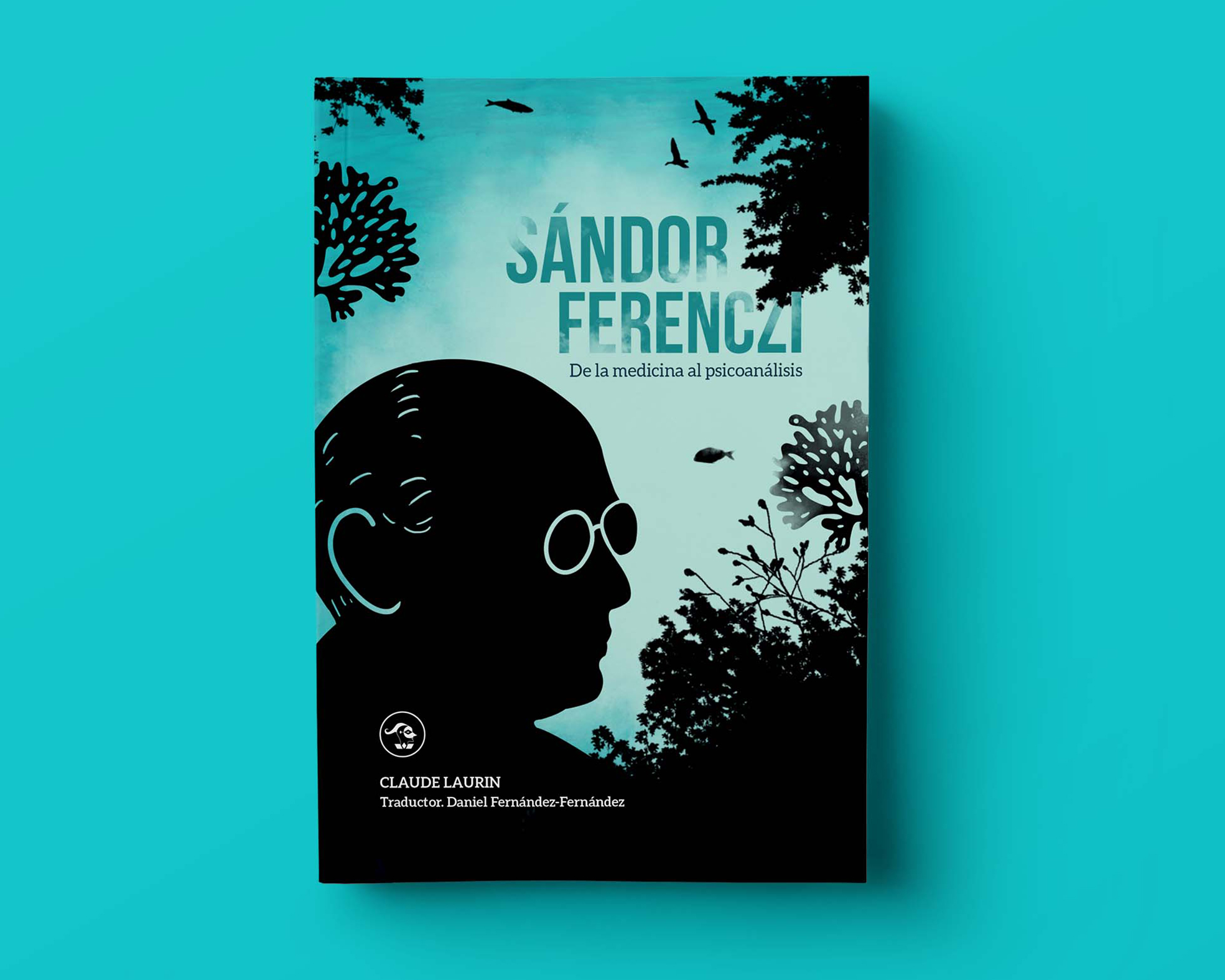
Sándor Ferenczi
An academic study of Sándor Ferenczi's passage from medicine to psychoanalysis.
I approached the cover as a surrealist illustration, a movement historically tied to psychoanalysis and its interest in the unconscious. Natural elements (corals, trees, fish, birds) stand in for Ferenczi's analogies between biology and psyche. The figures are rendered as silhouettes, standing in for the unknown, what has yet to be revealed.
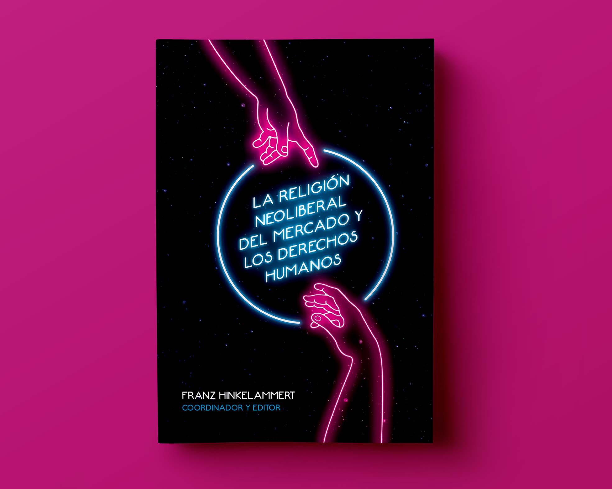
The neoliberal religion of the market and human rights
An academic book arguing that neoliberalism functions as a secular religion, with the market occupying the place theology once did — and that the human being, under that regime, is put at the service of the market when it should be the other way around.
The cover draws on Michelangelo's Creation of Adam to evoke the figure of a god, and with it, religion itself while the line rendering turns that divine gesture into something closer to the invisible hand metaphor form Adam Smith. The neon treatment alludes to spectacle, commerce, and advertising. The hands are positioned to suggest submission rather than encounter.