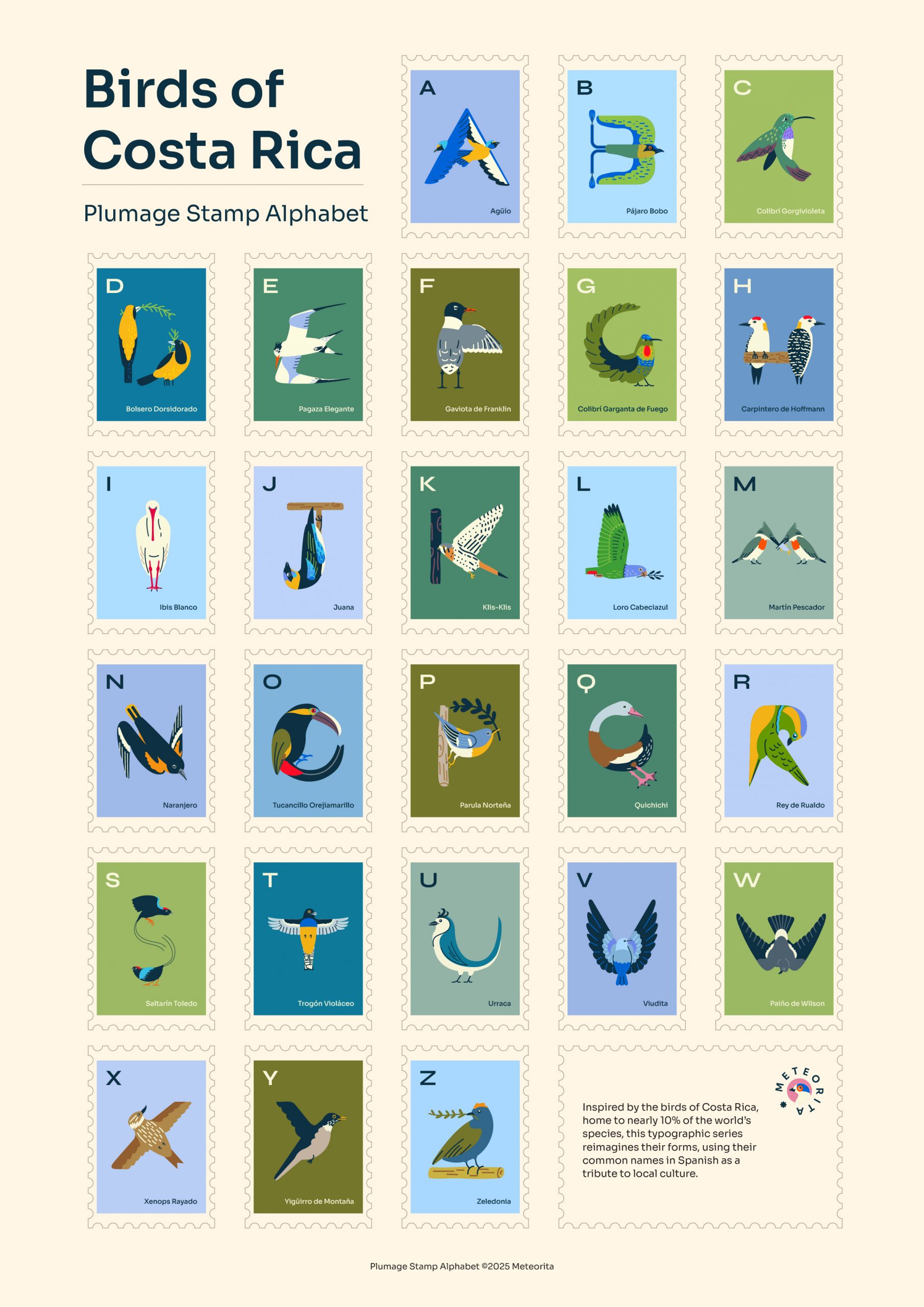
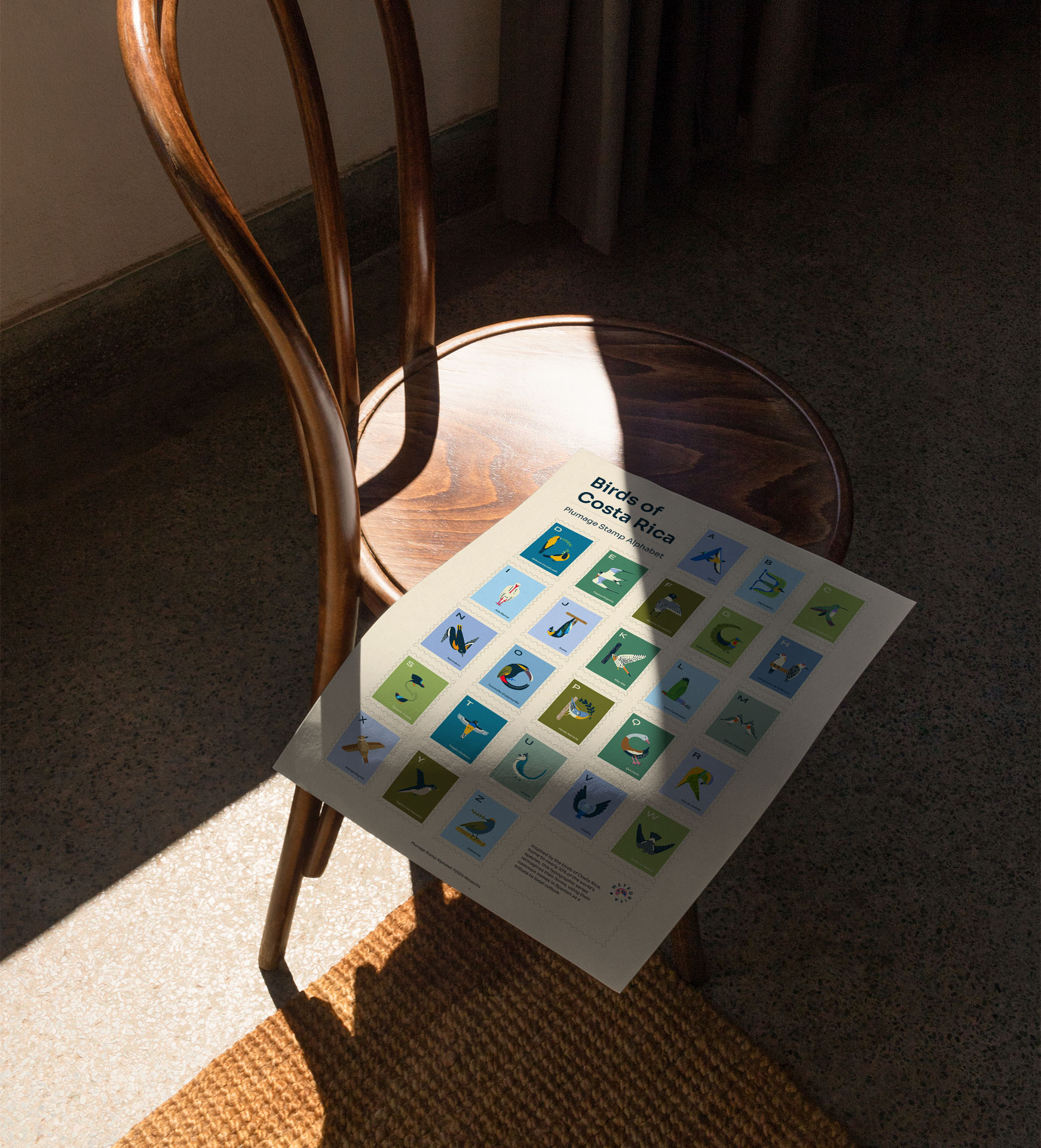
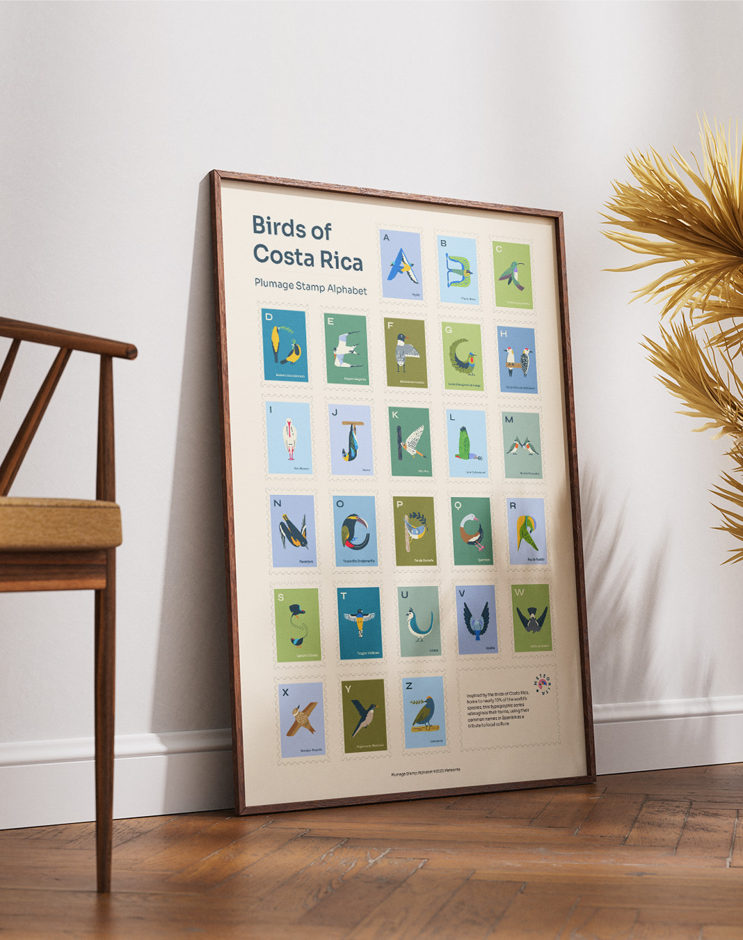
Plumage Stamp Alphabet
A visual alphabet inspired by Costa Rican birds. This small country is home to nearly 10% of the world’s bird species. Their common names appear in Spanish, as a tribute to local culture and language.
Just like postage stamps, birds cross borders. They travel freely between countries, connecting distant places, like a letter finding its way across the world.
Client
Self-initiated
Role
Typographic System, Illustration, Concept
Year
2025
Context
The project started from a public dataset maintained by the Costa Rican Ornithological Association, with over 900 species organized by taxonomy and without visual references. To build a typographic system from that material, I had to work through it manually: identifying which species were visually distinctive, mapping them to letters, and deciding which layer of naming would anchor the system. The work began as much in research and curation as in illustration.
To choose the naming system, I considered three options. Scientific names were too repetitive, and English common names felt detached from the cultural intent of the project. Costa Rican common names in Spanish anchored each letter in local usage, for instance, 'Pájaro Bobo' for B and turned the alphabet into a small tribute to local language as much as to fauna.
From there, a system emerged: a small set of constraints, applied across 26 stamps, with enough consistency to read as a whole and enough variation to keep each piece specific to its subject.
The system, in five rules:
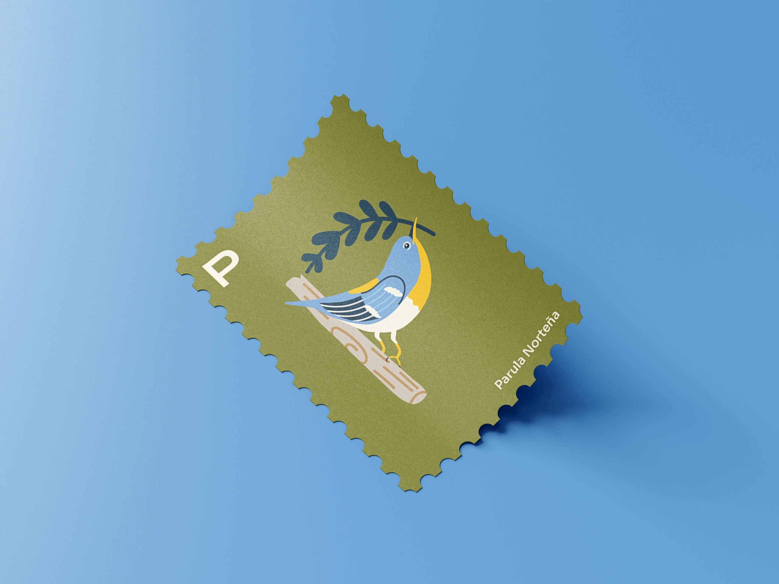
- Each stamp pairs one letter with a bird from Costa Rica's native fauna. The bird must be visually recognizable and rendered with its real colors and anatomical proportions.
- The bird's common Spanish name determines the letter, prioritizing the most distinctive noun over adjectives or generic classifiers (Trogón violáceo for T, Rey de Rualdo for R).
- Each bird inhabits the letter form without dissolving into it. The result should read as a letter and remain identifiable as a bird.
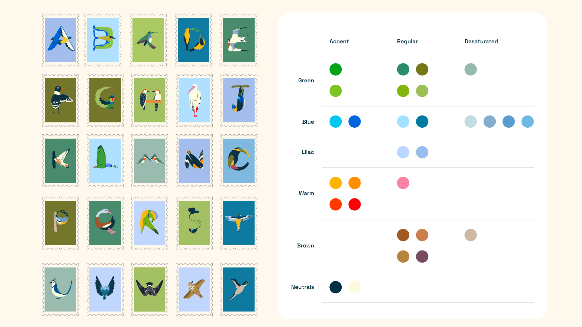
- Color and scale are calibrated across the collection. A consolidated palette is shared across all stamps, with adjacent pieces using contrasting backgrounds to avoid visual repetition.
- The format follows real stamp proportions (1:1.4 vertical) at 100×140mm. Illustration files are built at 200×280mm, with enough resolution to scale from stamp-sized applications to large-format prints.
Process
Decision 1: Shaping the letters
The space of possible solutions ran from one extreme (animals as ornament around pre-existing letterforms) to the other (animals forming the letter entirely through their body shape). I chose a position in between: the bird's body forms the letter primarily, supported by branches, perches, or natural elements that complete the form without dominating it.
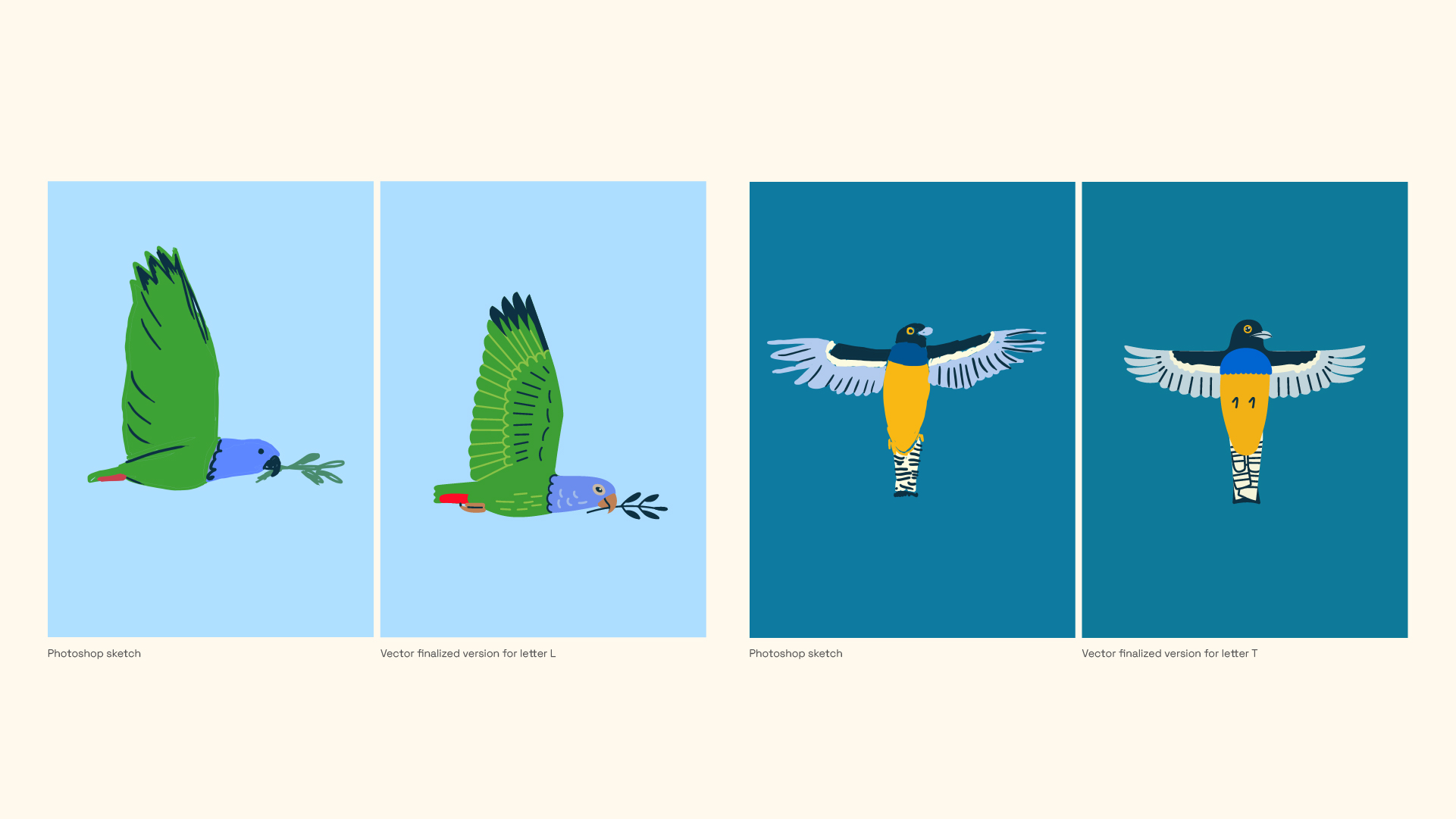
Some letters came quickly. Others took several iterations before the form held. The letter B went through three attempts before the final version, each testing a different body posture, a different tail position, a different relationship between bird and letterform.
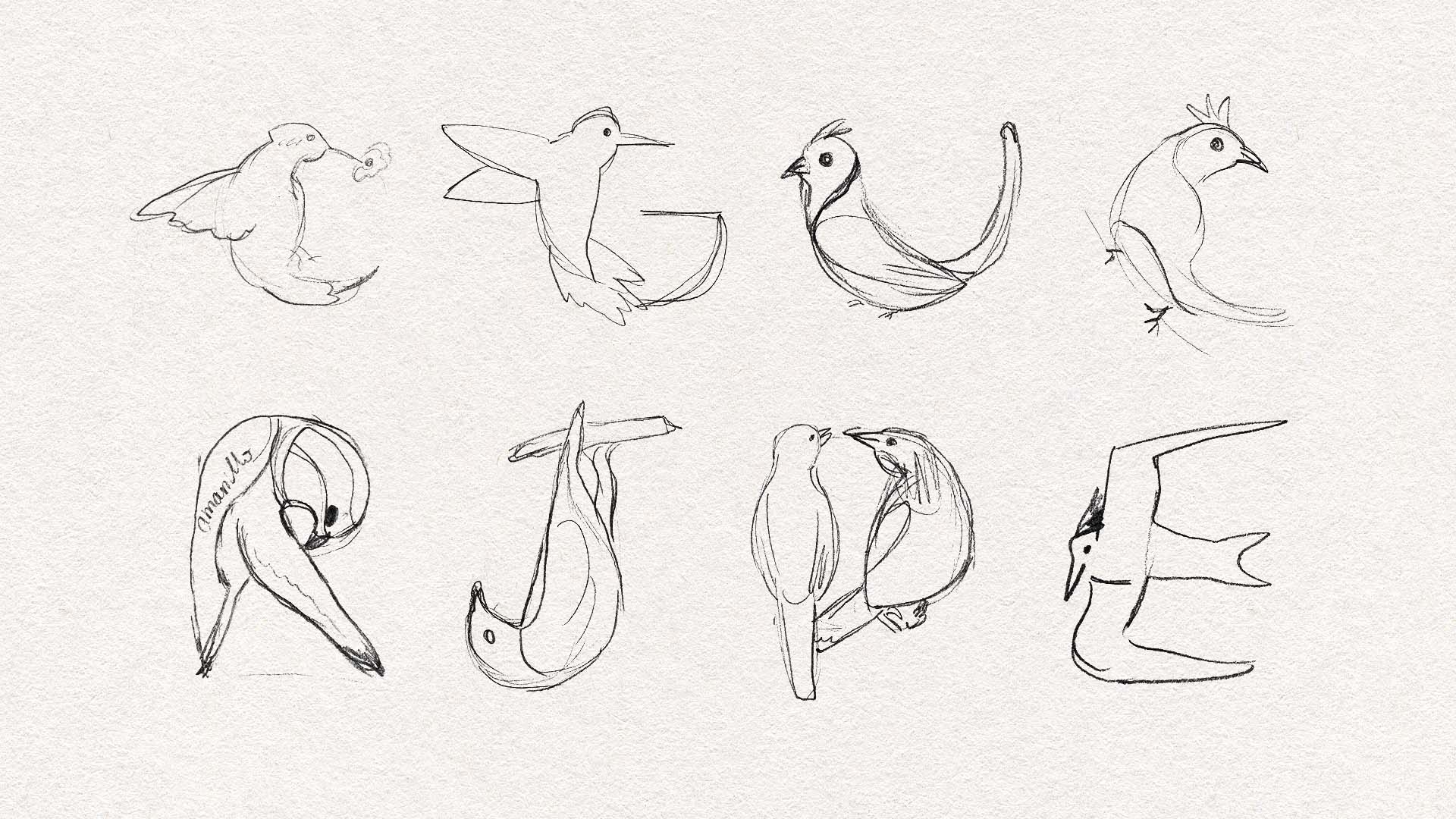
Early sketches on paper, before digital iteration.
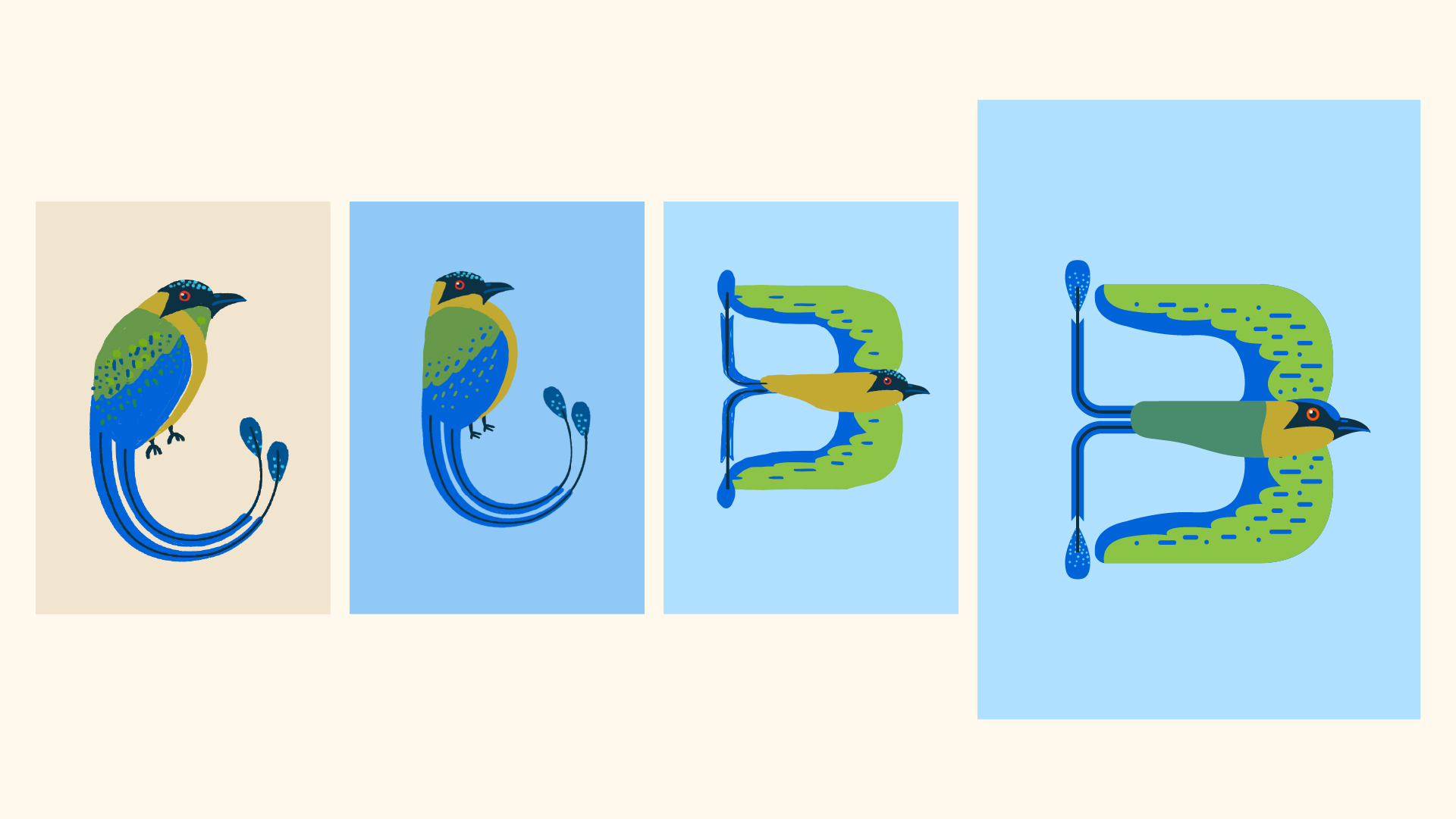
Three attempts at the letter B before the final version (far right).
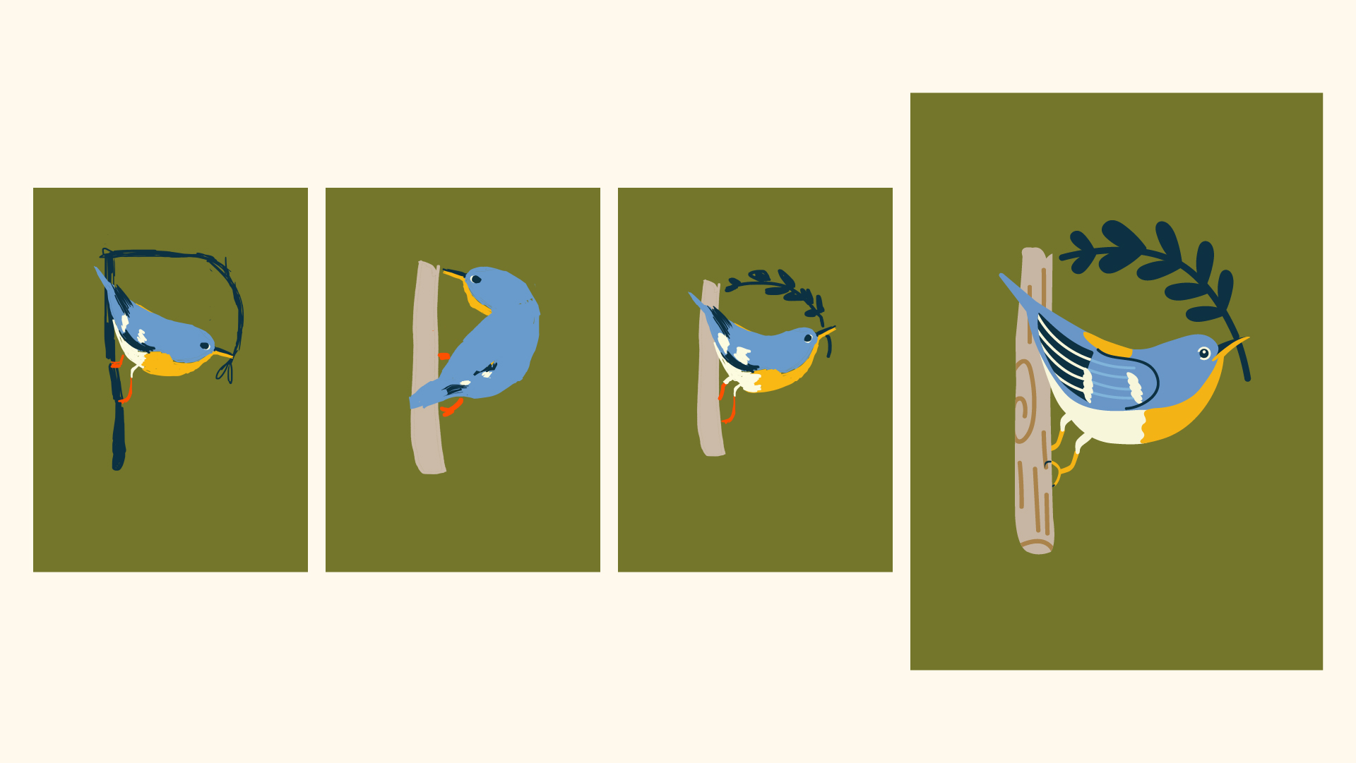
Four attempts at the letter P before the final version (far right).
Decision 2: Consolidating the palette
Birds have specific colors, and I wanted each bird to be recognizable, so the colors had to match. With 26 birds in the same system, the palette risked becoming chaotic. I sketched each bird respecting its natural colors first, without thinking about the collection as a whole.
Once the full sketches were drafted, I placed all 26 in a single Illustrator document and edited the palette down. I chose one yellow, one red, one set of greens and blues, to enforce coherence. Background colors were assigned afterward, ensuring contrast within each stamp and avoiding repetition between adjacent ones.
Decision 3: Vector over raster
Early digital sketches were built in Photoshop, which was faster for exploring shape. But the final style was clean, geometric, and needed to scale from stamp size (100×140mm) down to even smaller applications without losing detail. Every sketch was eventually redrawn as a vector, using the original Photoshop version as reference.
Decision 4: Grid and scale consistency
For the collection to read as a system, every bird had to occupy a comparable amount of space within its stamp, regardless of its real-life size. A small hummingbird and a large toucan needed visual presence on the same page. I built a grid that defined maximum bounds for each illustration, calibrated against the typography at the top and bottom.
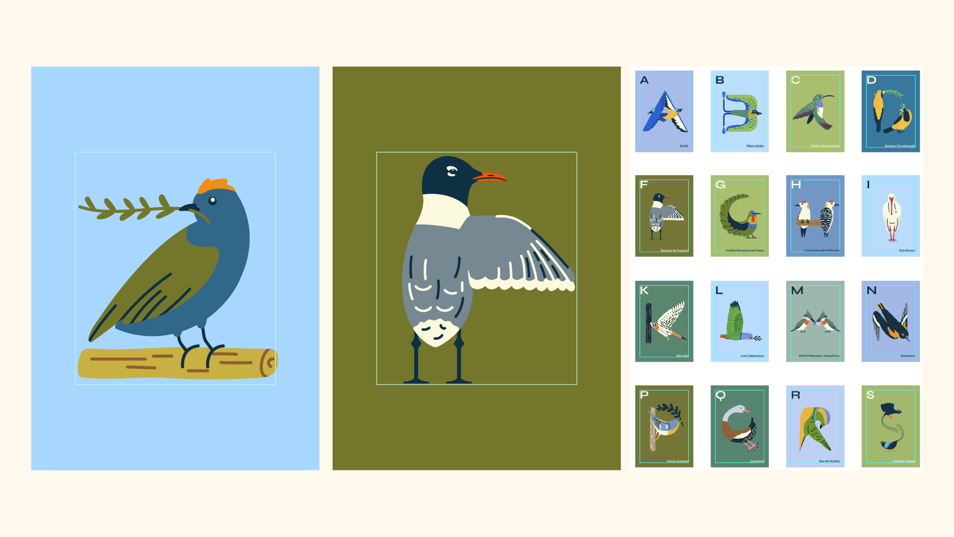
Grid for each illustration and for the entire system.
The system, complete
All 26 stamps arranged as a printable flyer.
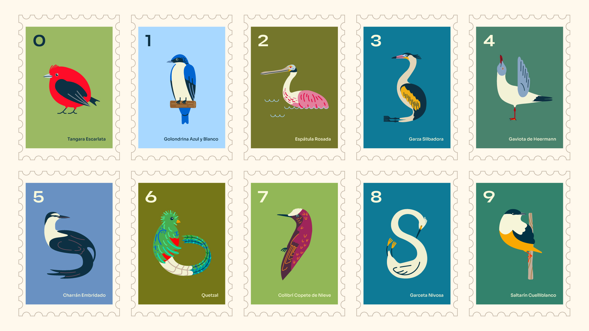
36 days of type
The alphabet was extended with 10 additional stamps covering the numbers 0–9, so the collection could also serve as a 36 Days of Type entry. The extended version lives alongside the alphabet but doesn't replace it.
One stamp at a time
Each stamp was designed to hold on its own, independent of the collection around it.


