Information design
Between 2021 and 2022, I designed a series of information-heavy presentations for DiDi across different Latin American markets. Each was commissioned separately, for a different purpose and audience, and each required translating large volumes of data into something a specific reader could actually use. Some pieces were built inside DiDi's visual system, others were designed without it, depending on what each context called for.
Client
DiDi
Role
Visual Design
Year
2021-2022
Challenge
The core challenge across all three pieces was the same: large volumes of dense data that had to be digested, filtered, and translated into something a reader could scan and understand quickly. Most of the work happened before any design decision, identifying which data points mattered, how they related to each other, and which visualization format would carry them without distortion.

Approach
Instead of applying a single visual style, I approached each presentation as a communication problem.
I focused on:
- read the data before designing anything, understand what it's saying, not just what it shows
- decide what earns a visualization and what can be a sentence
- match the format to the shape of the data, not to what looks good on the slide
- adjusting visual language depending on audience and context
Key Findings Digital Platform Study
Key findings from a digital platforms study in Costa Rica conducted by CID Gallup for the Cámara de Comercio de Costa Rica (the Costa Rican Chamber of Commerce) in April of 2022, communicating behavioral data across three user segments: drivers, delivery partners, and passengers. The data highlights income dependency on the platforms, the impact of the COVID-19 pandemic, education levels, and other key demographic and economic indicators.
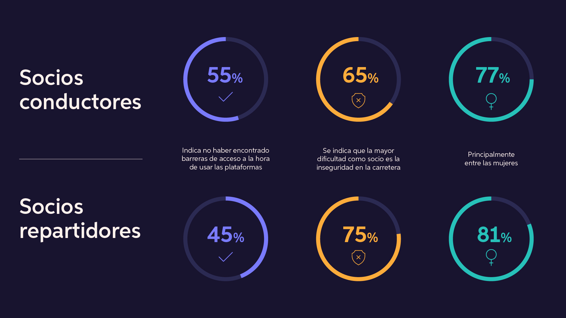
I structured data symmetrically to enable quick comparison between drivers and delivery partners, allowing stakeholders to identify differences at a glance without additional cognitive effort.
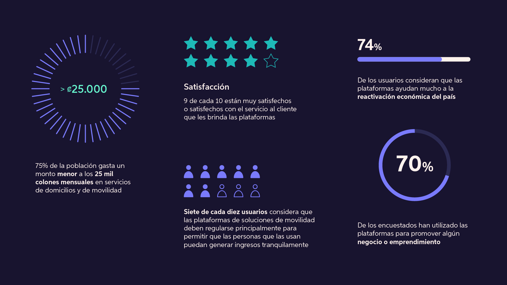
Different visualization types combined to represent distinct data points while maintaining a clear reading flow.

More infographics from this presentation.
Understanding Corruption in Colombia
Infographics developed to contextualize the political and anti-corruption landscape in Colombia, supporting DiDi's regulatory strategy in the market. The design balances dense information with visual hierarchy to make complex political data readable for non-specialist audiences.
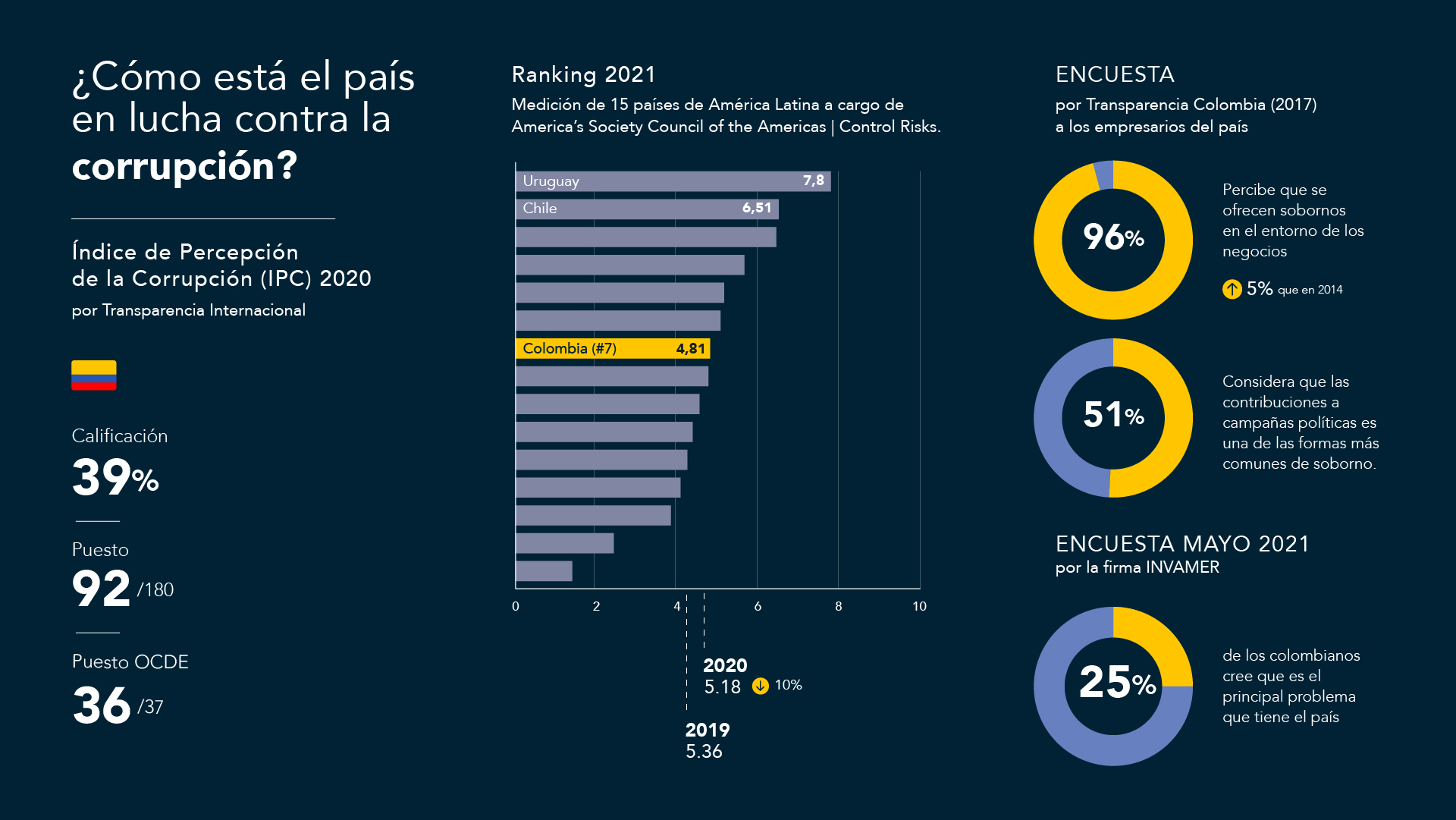
I consolidated multiple data sources into a single narrative, using visual hierarchy to guide attention from key indicators to supporting data.
Highlighted change over time using directional cues and contrast, prioritizing insight comprehension over raw data display.
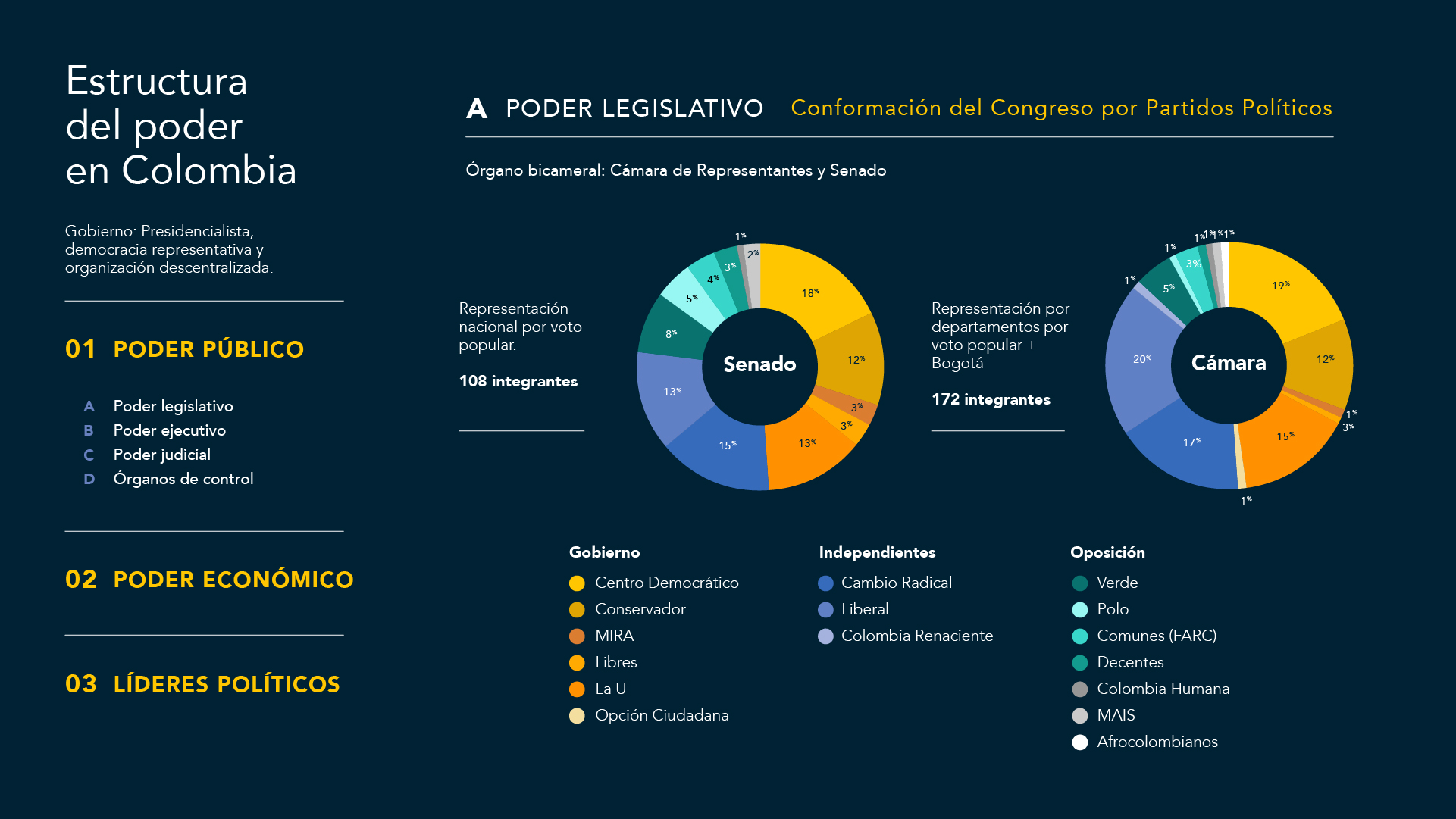
I structured information to guide users from high-level categories to detailed breakdowns, improving comprehension of a complex political system by using color coding and grouping to differentiate political entities.
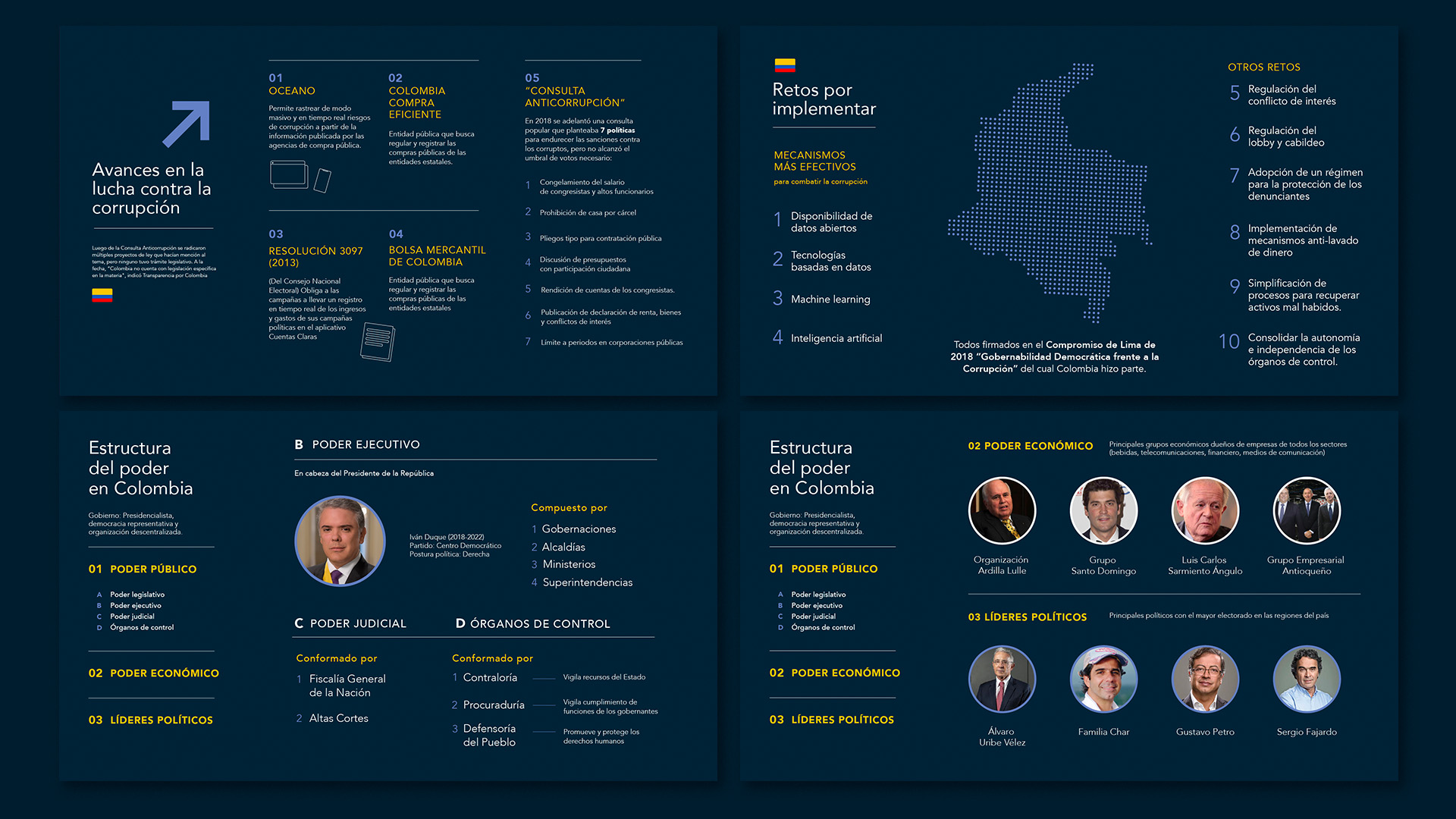
Other slides from this presentation
Survey results DiDi Drivers
Internal survey results communicating financial behavior and income dependency among DiDi drivers in Colombia. Unlike the previous two pieces, this one was designed using DiDi's illustration system to maintain brand consistency while adapting a brand language into an information-dense format.
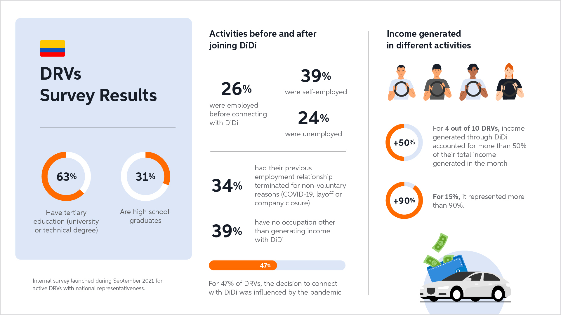
Structured information into clear sections to help executives scan key insights without reading the entire slide.
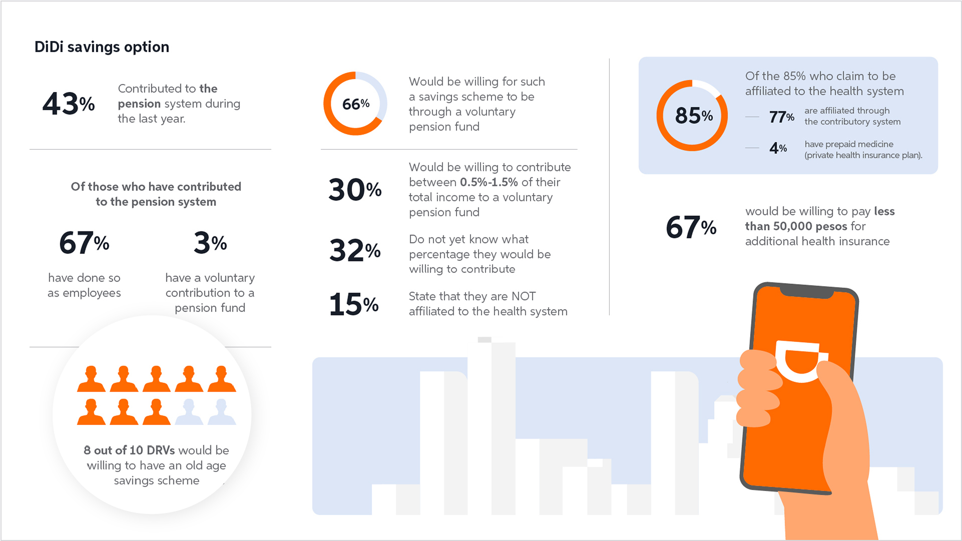
Used human-shaped units instead of abstract charts to reinforce the context of the data (people), improving immediate comprehension without requiring interpretation.
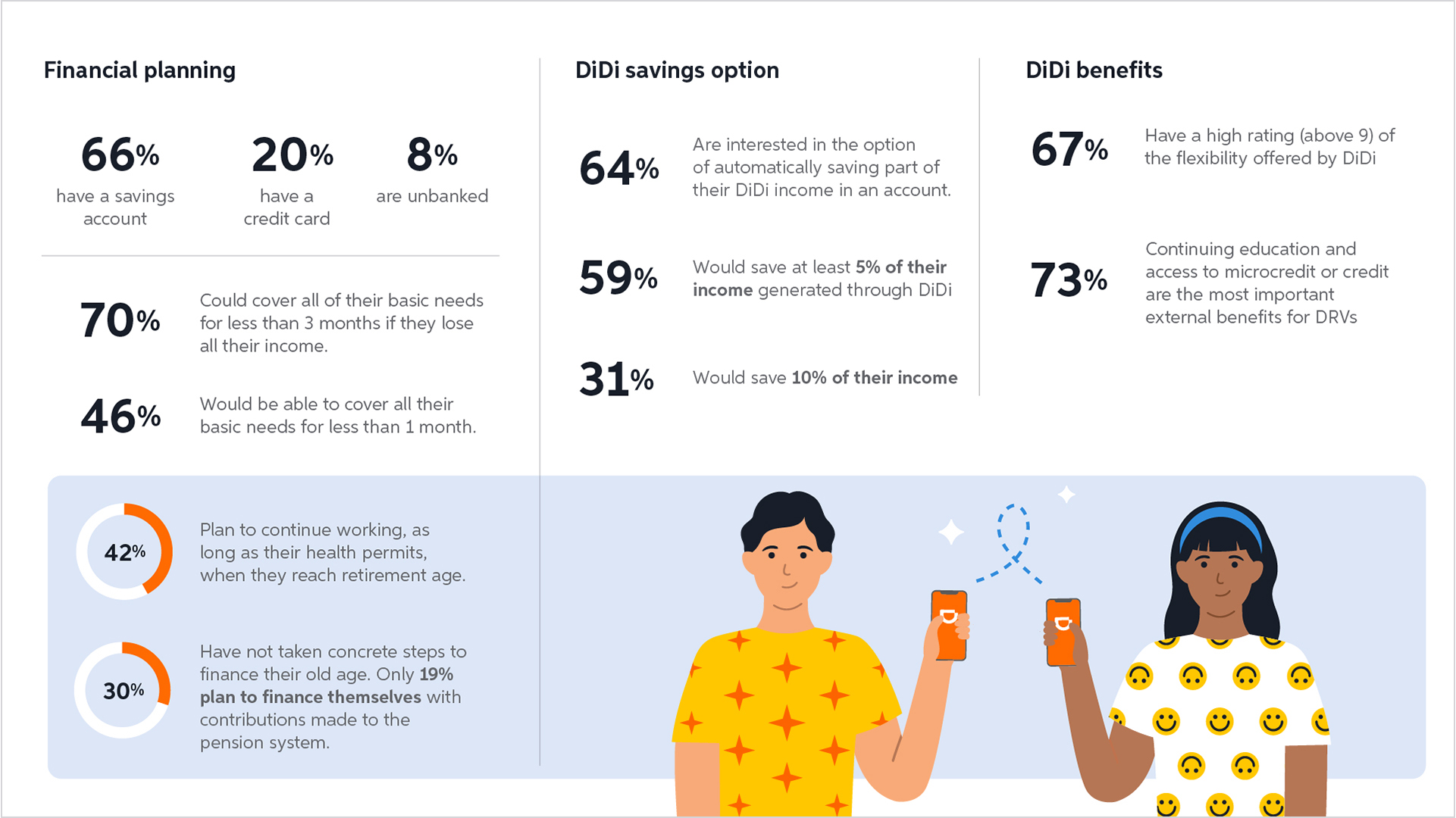
Grouped related data points into thematic sections to reduce cognitive load and improve comprehension and used visual emphasis to guide attention toward the most relevant insights instead of presenting all data equally.
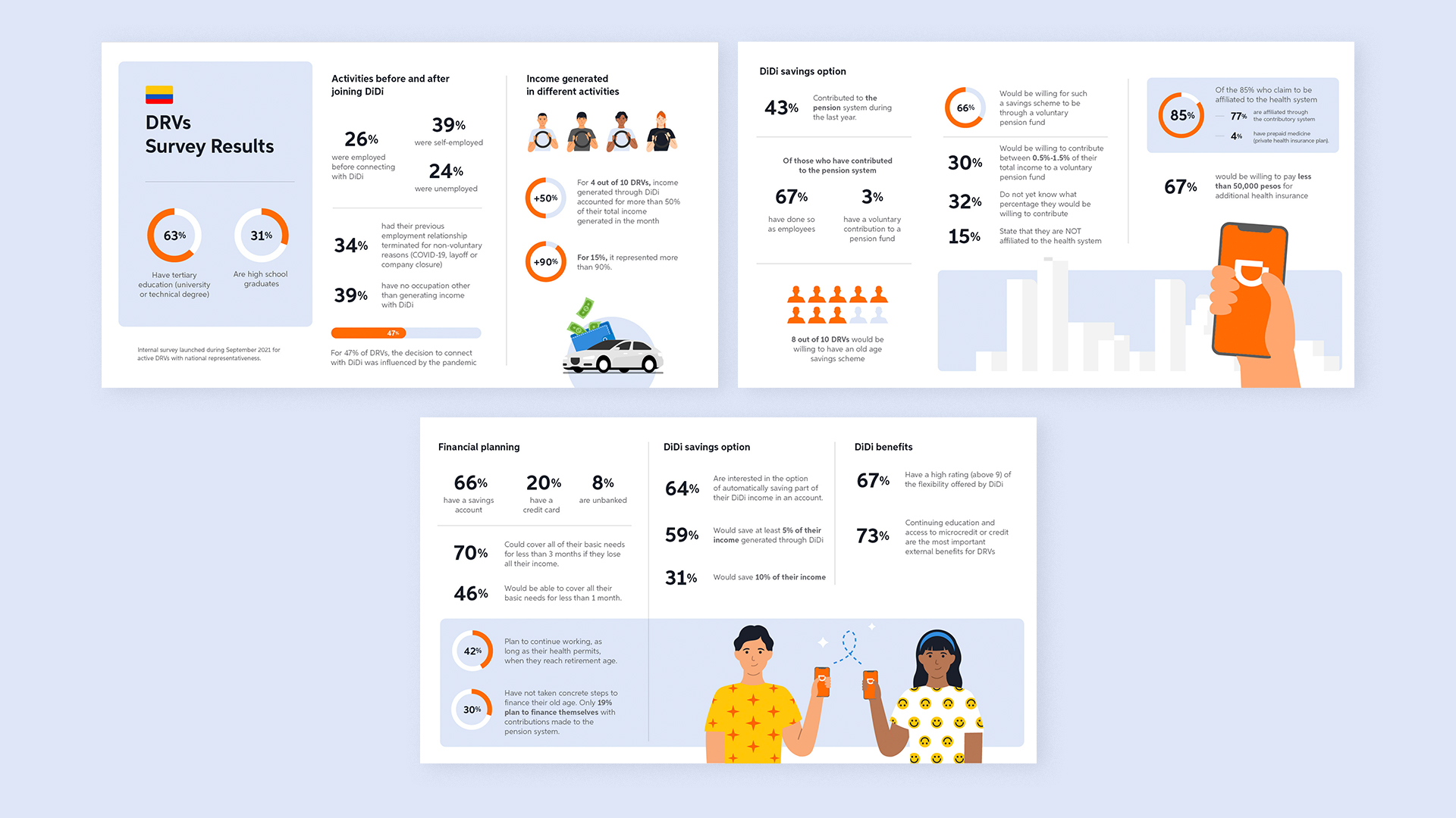
All slides
Impact
These visualizations helped make complex insights more accessible across markets and stakeholders, improving clarity, comparability and decision-making.